Your customers aren’t just browsing on laptops anymore — they’re scrolling from phones, tapping on tablets, and Googling your business from everywhere.
And if your website doesn’t adjust and perform across every screen?
They’ll bounce — fast.
That’s where responsive website design comes in.
Responsive website design ensures your site automatically adapts to the device it’s being viewed on — delivering a seamless, user-friendly experience whether someone’s on a smartphone, desktop, or anything in between.
It’s not just about looking good on mobile.
It’s about:
- Faster load times
- Easier navigation
- Higher engagement
- Better search rankings
- And more conversions
In this guide, we’ll break down:
- What responsive design really means (and doesn’t)
- Why it’s non-negotiable for small businesses in 2025
- Key features, tools, and frameworks that make it work
- How to test if your site is truly responsive
- And when it’s time to redesign vs retrofit
Because in today’s world, a site that doesn’t work on mobile… doesn’t work at all.
What is Responsive Website Design?
At its core, responsive website design means your site adapts automatically to any screen size — whether it’s a smartphone, tablet, laptop, or extra-wide desktop.
It’s not a separate “mobile site.” It’s one flexible design that reshapes itself to match the device it’s being viewed on — no pinching, zooming, or squinting required.
A Simple Analogy:
Responsive website design is like water.
It flows to fit the container — tall and narrow, short and wide, whatever.
Your website should do the same.
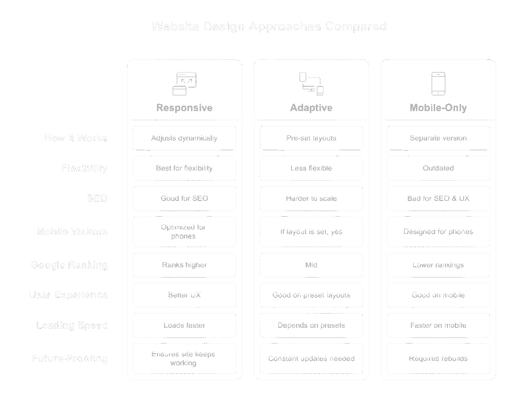
Responsive vs. Adaptive vs. Mobile-Only
Let’s break down the common approaches:
| Design Type | How It Works | Why It Matters |
|---|---|---|
| Responsive | One site that adjusts dynamically | Best for flexibility + SEO |
| Adaptive | Pre-set layouts for specific device sizes | Less flexible, harder to scale |
| Mobile-Only | Separate version of site just for phones | Outdated, bad for SEO & UX |
Responsive is the standard in 2025 — and it’s what Google expects.
Why It’s a Big Deal for Small Businesses
If you’re not thinking mobile-first, you’re already behind.
Here’s why responsive design matters more than ever:
1. Most of Your Visitors Are on Mobile
Over 60% of web traffic comes from mobile devices.
If your site isn’t optimized for phones, you’re instantly frustrating the majority of your audience.
2. Google Ranks Mobile-Responsive Sites Higher
Since Google switched to mobile-first indexing, your site’s mobile version is now your primary version in the eyes of search engines.
Not mobile-friendly? Expect lower rankings and less visibility.
3. Better UX = More Conversions
Responsive sites:
- Load faster
- Make CTAs easier to tap
- Reduce confusion
- Keep users engaged longer
Which means more form submissions, calls, and checkouts.
4. It Future-Proofs Your Site
As new devices and screen sizes roll out, responsive design ensures your site keeps working — without needing constant rebuilds.
Key Features of a Responsive Website
Not all “mobile-friendly” sites are truly responsive.
A well-built responsive site doesn’t just shrink to fit a screen — it reflows, resizes, and prioritizes content so everything is easy to read, tap, and navigate, no matter the device.
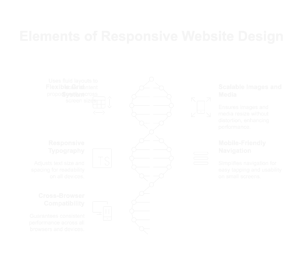
Here are the must-have elements of real responsive website design:
1. Flexible Grid System
Responsive websites are built on fluid grid layouts — not fixed pixel widths.
Instead of locking your site to one screen size, the layout scales proportionally using percentages and breakpoints.
This allows content to rearrange naturally on small, medium, or large screens.
2. Scalable Images and Media
Images should resize automatically to fit the screen — without distortion or awkward cropping.
Use:
- Max-width: 100% CSS rules
- Responsive image formats (like WebP)
- Lazy loading for faster performance
Videos, sliders, and background images need this too — not just photos.
3. Responsive Typography
Text should:
- Scale based on screen size
- Use relative units (like rem or em, not px)
- Maintain line spacing and readability on all devices
Bonus: Bigger font sizes and line height improve accessibility and mobile UX.
4. Mobile-Friendly Navigation
On small screens, navigation should be simplified and optimized for tapping.
Common solutions:
- “Hamburger” menus
- Sticky headers
- Expandable accordions for submenus
- Large, finger-friendly links and buttons
Menus shouldn’t break or feel cramped on mobile.
5. Cross-Browser & Cross-Device Compatibility
Responsive website design should work everywhere — not just on your iPhone or Chrome.
That means testing across:
- Safari, Firefox, Edge, and Chrome
- Android and iOS
- Tablets, laptops, and desktops
- Portrait and landscape mode
What looks good on one screen may fall apart on another. Test everything.
How Responsive Design Impacts SEO and Performance
Think responsive website design is just about convenience?
Google — and your customers — would strongly disagree.
In 2025, responsive websites don’t just look better. They perform better — in search results, loading speed, and user engagement.
Here’s how:
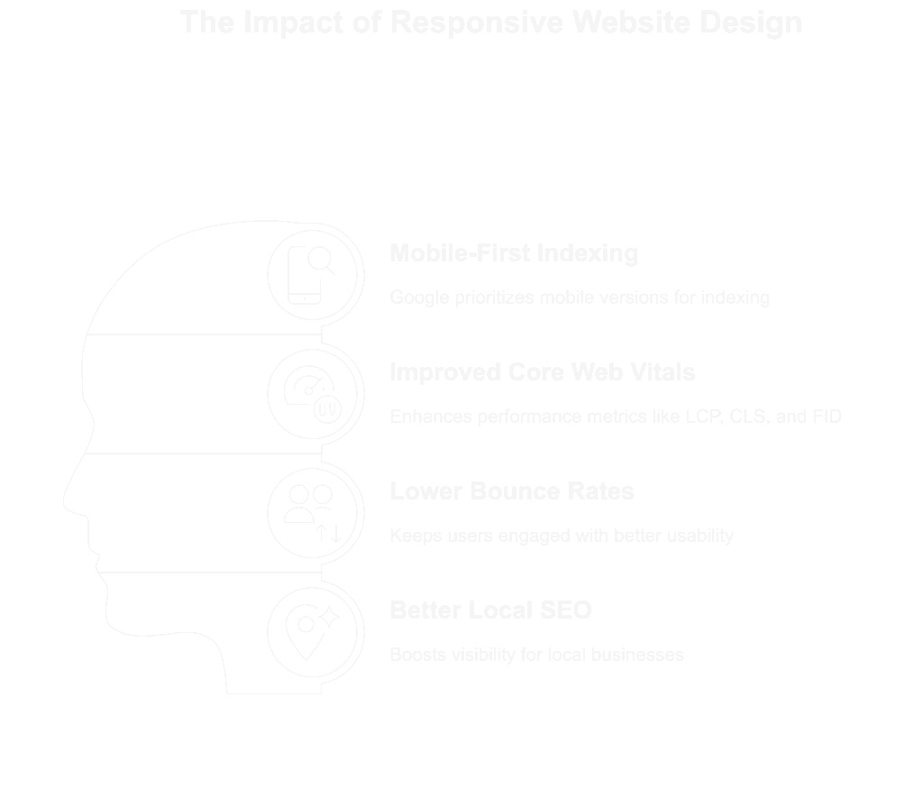
1. Mobile-First Indexing Is the Default
Google now uses the mobile version of your site as the primary version for indexing and ranking.
If your mobile experience is broken, incomplete, or slow — that’s what Google sees.
A fully responsive site ensures your content, structure, and functionality stay consistent (and optimized) across all devices.
2. Improved Core Web Vitals Scores
Core Web Vitals are Google’s performance metrics that directly influence rankings.
Responsive website design helps improve:
- LCP (Largest Contentful Paint) — faster loading of main content
- CLS (Cumulative Layout Shift) — stable layout on different screen sizes
- FID (First Input Delay) — smoother interaction, especially on mobile
These metrics are tied to real-world user experience — and Google rewards that.
3. Lower Bounce Rates, Higher Engagement
Users are quick to judge a site that:
- Takes too long to load
- Has tiny buttons they can’t tap
- Looks broken on their phone
Responsive sites keep users engaged by being easy to use, fast to load, and smooth to scroll — especially on mobile.
That leads to lower bounce rates and higher time on page — both positive ranking signals.
4. Better Local SEO
For service-based and location-driven businesses, mobile usability is especially important.
A responsive site:
- Improves click-through rates on mobile local searches
- Ensures your Google Business Profile links (like “Website”) lead to a usable experience
- Boosts credibility when users visit your site after finding you in Maps or search
A mobile user is often a high-intent user. Responsive design makes sure they stick.
Common Responsive Website Design Mistakes to Avoid
Plenty of websites claim to be responsive — but in reality, they just shrink and squish content, leaving users frustrated.
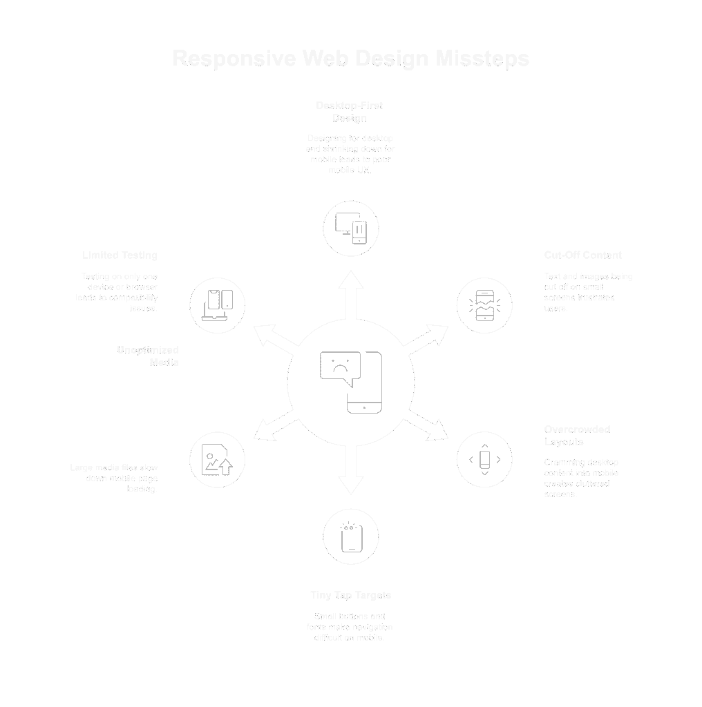
Here are the most common missteps we see (and how to avoid them):
1. Designing Desktop-First and “Shrinking Down”
Responsive design isn’t about building a full desktop layout and hoping it survives on mobile.
Instead:
Start with mobile-first thinking — then scale up for larger screens.
If it doesn’t work on mobile, it doesn’t work. Period.
2. Cut-Off Text, Images, or CTAs on Small Screens
If your buttons or headlines get chopped off on mobile, users will scroll away fast — or never see your call to action.
Always test on real devices, not just browser resizes.
3. Overcrowded Mobile Layouts
Trying to cram everything from desktop into the mobile view?
That creates cluttered, overwhelming screens.
✅ Collapse content where needed (accordions, sliders)
✅ Prioritize what matters most (CTA, key info, contact options)
Mobile design is about focus, not just formatting.
4. Tiny Tap Targets and Unreadable Fonts
Small buttons and body text = bad mobile UX.
✅ Follow the 16px rule for base font size
✅ Buttons should be easily tappable with a thumb (44px x 44px minimum)
5. Forgetting to Optimize Media
Large images and embedded media can slow down mobile pages dramatically.
✅ Use responsive image sizes and compress assets
✅ Don’t autoplay large videos on mobile
✅ Lazy-load below-the-fold content
Speed matters — especially for mobile SEO and conversion rates.
6. Testing on Only One Device or Browser
Just because your site looks good on your iPhone doesn’t mean it’s good to go.
Test on:
- Android and iOS
- Chrome, Safari, Firefox, Edge
- Various screen sizes (not just iPhone + MacBook)
Use tools like BrowserStack or Chrome DevTools emulators to preview accurately.
Responsive Website Design Tools, Themes, and Frameworks
You don’t need to start from scratch to create a responsive website — modern platforms and tools make it faster (and more affordable) than ever.
Here’s what to use:
1. WordPress Themes Built for Responsiveness
These themes come with built-in mobile-first layouts and controls:
- Astra – lightweight, fast, and highly customizable
- GeneratePress – clean code and strong mobile performance
- Kadence – great for marketers and service businesses
- Blocksy – modern design with responsiveness baked in
Ideal for small business owners using WordPress + page builders.
2. Page Builders with Responsive Controls
Visual page builders let you design per device (desktop, tablet, mobile) with easy drag-and-drop tools:
- Elementor (WordPress)
- Bricks Builder (lightweight & mobile-first)
- Divi (popular but heavier)
- Webflow (great for no-code design with full control)
These builders let you adjust font sizes, margins, image placement, and visibility based on screen size.
3. Frameworks for Developers
For those working with custom code:
- Bootstrap – the most popular responsive grid system
- Tailwind CSS – utility-first CSS framework for precise control
- Foundation – advanced responsive framework by Zurb
These provide mobile-first grids, breakpoints, and UI components out of the box.
4. Testing Tools for Responsiveness
Don’t just assume your site is responsive — test it.
- Google’s Mobile-Friendly Test – basic pass/fail check
- Chrome DevTools – built-in emulator for all device sizes
- Responsively App – preview your site on multiple devices side-by-side
- BrowserStack – test on real devices, browsers, and operating systems
Testing across devices helps you catch bugs before your users do.
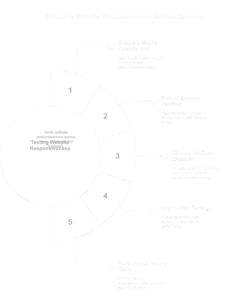
How to Test If Your Website Is Truly Responsive
Just because your site “looks fine” on your laptop doesn’t mean it’s responsive.
To know for sure, you need to test how it behaves across multiple screen sizes, browsers, and devices.
Here’s how to check — the smart way:
1. Use Google’s Mobile-Friendly Test
Simple, free, and straight from the source (Google).
- Go to search.google.com/test/mobile-friendly
- Enter your site URL
- Get a pass/fail report plus suggestions for improvements
This is the bare minimum if you care about SEO.
2. Resize Your Browser (the Manual Way)
Open your site and manually shrink the window. Watch how:
- The layout adjusts (or doesn’t)
- Navigation collapses or breaks
- Images and text reflow on the page
It’s a quick way to catch basic issues like overlapping content or missing buttons.
3. Use Chrome DevTools (Built-in Emulator)
- Right-click your site → Inspect
- Click the “Toggle device toolbar” icon (top left of DevTools panel)
- Choose from a list of devices (iPhone, Galaxy, iPad, etc.)
- Rotate between portrait and landscape views
Great for checking font size, CTA visibility, and spacing across breakpoints.
4. Test on Actual Phones and Tablets
Real devices are the best test — period.
Pull up your site on:
- iPhone and Android
- Safari and Chrome
- Different screen sizes (small phones, large phones, tablets)
Pro tip: Test it on mobile data, not just Wi-Fi, to get a feel for load speed under real-world conditions.
5. Use Multi-Device Testing Tools
- Responsively App (free desktop app)
- BrowserStack (paid, but thorough)
- LambdaTest (cross-browser testing)
- ViewPort Resizer browser extension
These tools let you preview your site across dozens of devices simultaneously — ideal for agencies and designers.
Visit our article on UI/UX design to have the latest industry information on how to build high converting websites/webpages.
Final Word
Responsive website design isn’t a trend — it’s the baseline expectation in 2025.
Your visitors are coming from all directions: iPhones, Androids, tablets, desktops, even smart TVs. If your site doesn’t work for all of them, it’s not working — period.
The good news?
Responsive design doesn’t just protect you from bounce rates and SEO penalties — it actually improves performance:
- Faster load times
- Better user experience
- Higher trust
- More conversions
It’s not about fancy design.
It’s about function that fits your audience — no matter how or where they find you.
FAQs
What is responsive web design?
It’s a design approach where your website automatically adjusts to fit any screen size — mobile, tablet, desktop — for a seamless user experience.
Why is responsive design important?
It improves mobile usability, supports SEO, lowers bounce rates, and increases conversions by making your site easy to use on any device.
How do I know if my site is responsive?
Use Google’s Mobile-Friendly Test or test it on real devices. If the layout adjusts cleanly and is easy to navigate everywhere — it’s responsive.
How to make responsive website design?
If your site is built on a modern platform, minor tweaks might work. But older or desktop-only sites often need a full redesign. If starting from scratch, this guide is gold!
Does responsive design help SEO?
Yes. Google uses mobile-first indexing, and responsive sites tend to perform better in search thanks to improved UX and Core Web Vitals.

