Here’s a truth most business owners learn the hard way:
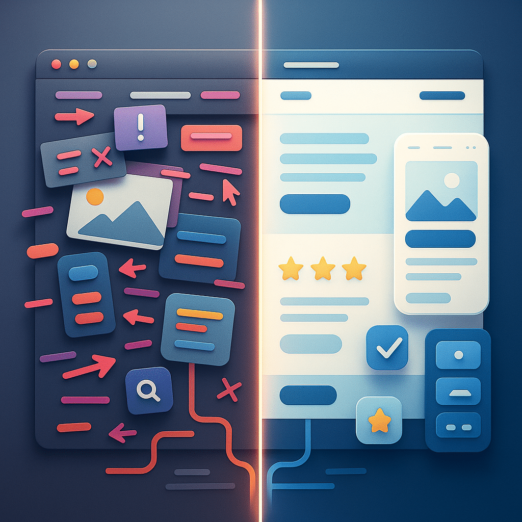
A beautiful website doesn’t guarantee results.
You can spend thousands on slick visuals and animations, but if people don’t know where to click, how to contact you, or what to do next?
They’ll leave. Fast.
That’s where UI/UX design comes in.
It’s not just about how your website looks.
It’s about how it works. Feels. Converts.
- UX is how easy it is for someone to navigate, understand, and take action on your site.
- UI is how it looks, think colors, fonts, buttons, layout, and flow.
Together, UI/UX design is what makes websites perform.
In this guide, we’ll break down:
- What UX and UI actually mean (in plain English)
- How good design improves your site’s performance and sales
- Key design principles that create clarity, trust, and conversions
- Common mistakes that hurt your UX
- Tools to improve your site’s experience
If your site isn’t converting visitors into customers, this is where to start.
What is UI UX Design ?
Let’s break this down simply:
- UX stands for User Experience
- UI stands for User Interface
They sound technical but they’re not complicated.
Together, they shape how your website works and feels to every visitor.
UX – User Experience
UX is the journey a user takes on your website from the second it loads to the moment they convert (or leave).
Good UX answers questions like:
- Is the site easy to navigate?
- Can I find what I’m looking for quickly?
- Does the process feel smooth, clear, and intuitive?
If your website confuses people, they’ll bounce.
If it guides them effortlessly, they’ll click, book, buy — or whatever action you want them to take.
UI – User Interface
UI is the visual layer; the layout, colors, buttons, fonts, and spacing that create the “look and feel” of your website.
Good UI:
- Makes your brand look professional
- Helps users focus on the right content
- Encourages clicks with clear visual cues (buttons, icons, etc.)
Bad UI? It looks outdated, inconsistent, or cluttered and it kills trust instantly.
A Simple Analogy: UX is the Restaurant Experience — UI is the Menu
Think of your website like a restaurant.
- The UI is the menu design, lighting, table layout, and aesthetic
- The UX is the service, food delivery, and how easy it is to get what you ordered
You need both to make the experience work — one without the other just feels… off.
Why UI/UX Design Matters for Your Business
When done right, UI/UX design helps:
- Increase time on site
- Reduce bounce rate
- Build trust quickly
- Boost conversions (bookings, leads, sales)
- Improve SEO performance (through Core Web Vitals and engagement signals)
It’s not about being fancy. It’s about being functional and persuasive.
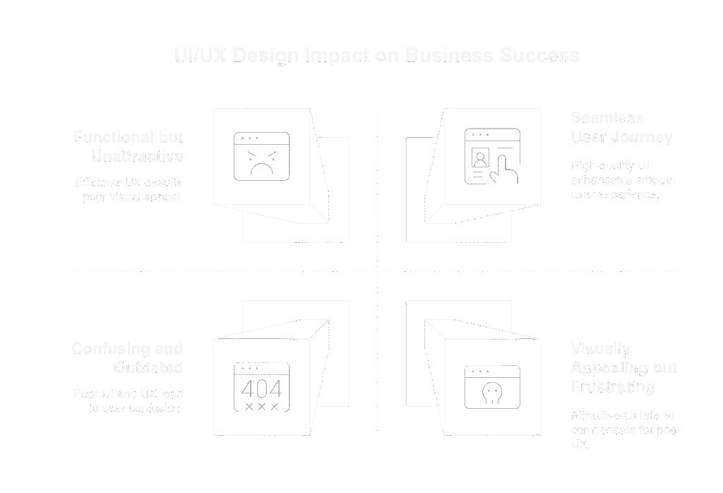
How UI/UX Affects Business Performance
You don’t need to guess whether UI/UX design matters the data proves it.
When your website is clear, intuitive, and visually aligned with your brand, people stay longer, click more, and convert faster.
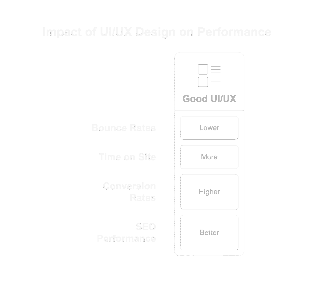
Here’s how smart UI/UX design directly affects performance:
Lower Bounce Rates
A confusing or cluttered site? Visitors bounce in seconds.
But when UX/UI is done right:
- Navigation feels natural
- Content is easy to scan
- Calls-to-action are obvious and inviting
Users stick around because they understand what to do next.
More Time on Site
Clean design + intuitive flow = more exploration.
Good UX encourages users to:
- Click into services
- Scroll through FAQs
- Check out testimonials or case studies
That engagement signals trust both to users and search engines.
Higher Conversion Rates
UI/UX design influences how people feel about your brand and how confidently they take action.
Improved design leads to:
- More form fills and quote requests
- More bookings or purchases
- Less cart abandonment or drop-off
Small tweaks (like better button placement or headline clarity) can unlock major gains.
Better SEO Performance
UX/UI doesn’t just help users it helps Google, too.
How?
- Fast load times
- Mobile responsiveness
- Clear site architecture
- High engagement = stronger ranking signals
Your design directly affects Core Web Vitals which is now a confirmed Google ranking factor.
Key UX Design Principles for a High-Converting Website
User experience (UX) isn’t about flashy effects or complex interactions, it’s about clarity, ease, and flow.
When a visitor lands on your site, they’re silently asking:
“Can I trust this? Is it clear? Do I know what to do next?”
Here’s how to make sure the answer is always “yes.”
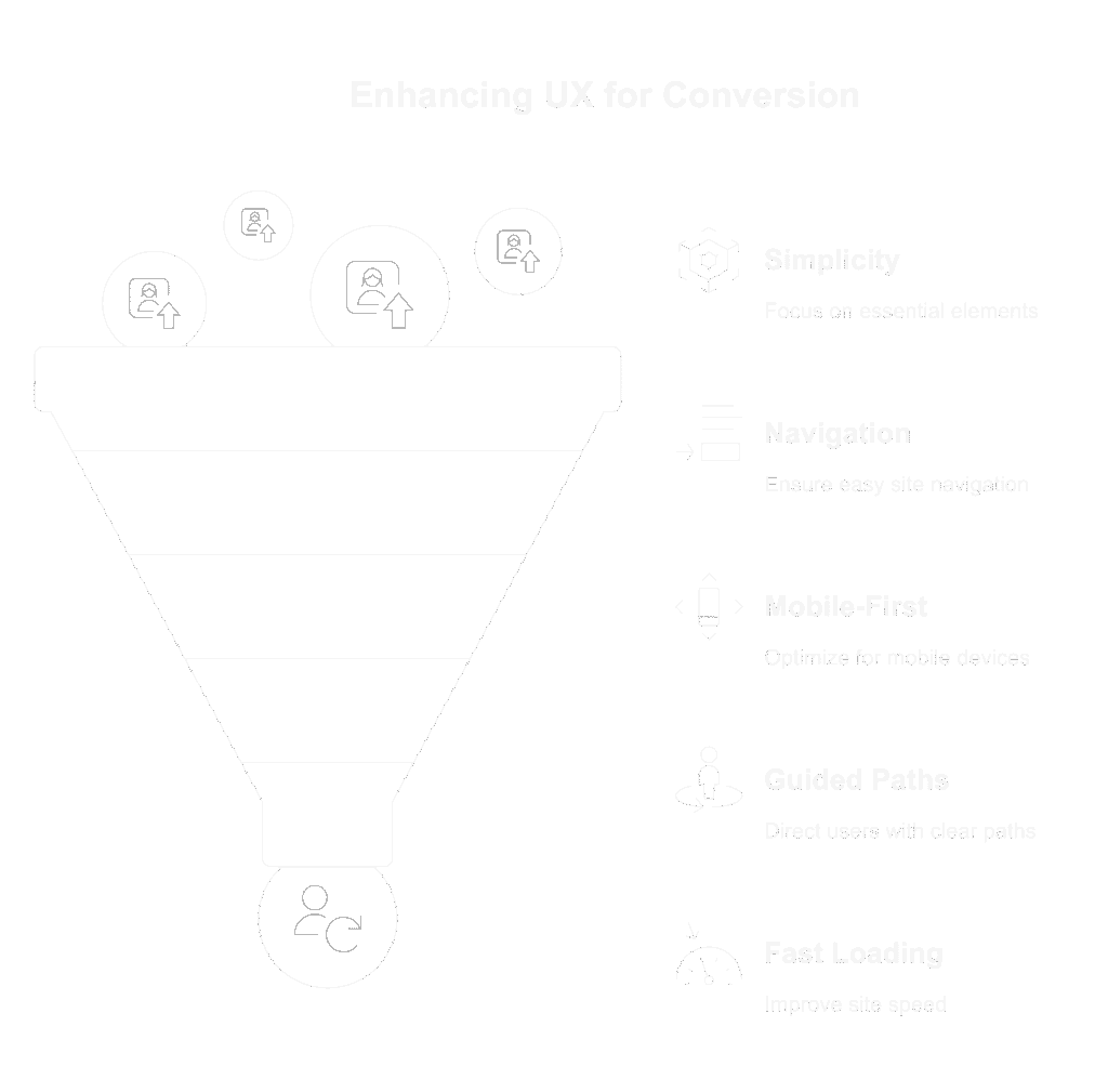
1. Simplicity Over Everything
Don’t overload the page with 10 buttons, 6 offers, and 3 popups.
✅ Keep layouts clean
✅ Use one primary goal per page
✅ Remove anything that doesn’t help conversion
The rule: If it’s not helping the user take action, it’s probably getting in the way.
2. Logical Navigation
Users should be able to find what they need without thinking.
- Use clear, consistent menu labels
- Group related content under logical categories
- Limit dropdown levels — 2 is enough
- Add breadcrumbs on deeper pages if needed
Confused users = out the door users.
3. Mobile-First Flow
Over 50% of website traffic is mobile and that number’s only going up.
Make sure your site:
- Loads fast on mobile
- Doesn’t cut off buttons or text
- Has tap-friendly spacing and font sizes
- Doesn’t bury your CTA below 10 scrolls
Test every page on your phone not just your desktop.
4. Clear, Guided User Paths
Every page should have a clear next step.
Ask yourself:
- Where do I want the user to go next?
- Is that obvious from the layout and CTA?
- Does the design support a “yes” decision?
Use directional cues (arrows, contrast, button size) to guide the eye.
5. Fast Load Times
If your site takes more than 3 seconds to load, a chunk of your traffic is bouncing.
Improve performance by:
- Compressing images
- Using lightweight design themes
- Minimizing plugins and scripts
Fast = trustworthy. And Google agrees.
Key UI Design Elements That Support the User Experience
UI is what your users see. UX is how they feel about it.
When UI is done well, it guides behavior, builds trust, and reinforces your brand, all without needing to say a word.
Let’s break down the UI essentials that support great user experiences:
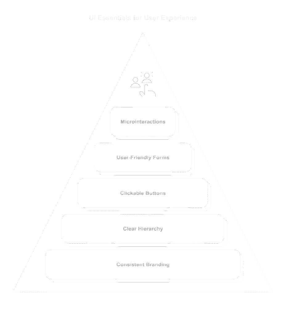
1. Consistent Branding and Color Usage
Visual consistency builds instant credibility.
✅ Use your brand’s color palette intentionally — especially for CTAs and highlights
✅ Stick with 1–2 fonts (max)
✅ Maintain consistent button styles, spacing, and iconography
Inconsistent design = unprofessional feel = lost trust.
2. Clear Visual Hierarchy
Your users shouldn’t have to hunt for important content — it should guide them naturally.
Use:
- Headings (H1, H2, H3) to organize text
- Bigger fonts and bold weights for key messages
- Contrast to draw attention to buttons or actions
- Whitespace to separate content blocks and reduce clutter
The most important thing on any page should look like the most important thing.
3. Buttons That Actually Look Clickable
Sounds obvious but you’d be surprised how many websites fail here.
✅ Use clear CTA language: “Book Now,” “Get a Quote,” “Start Free Trial”
✅ Make buttons a contrasting color from the background
✅ Use hover effects and visual cues to signal interactivity
If it looks like plain text or blends into the layout, people will scroll past it.
4. Clean, User-Friendly Forms
Forms are where conversions happen so make them painless.
✅ Ask only for what you need
✅ Use logical input order (Name → Email → Message)
✅ Add inline field labels and validation messages
✅ Design for mobile: stacked layout, easy tapping
Bonus tip: Autofill + progress bars = higher completion rates.
5. Subtle Microinteractions & Visual Feedback
Tiny UI touches = a big boost in user confidence.
Examples:
- A button changes color on hover
- A loading spinner while a form submits
- An animation when something is added to cart
These small cues reassure users that “yes, something is happening.”
Common UX/UI Mistakes That Hurt Conversions
You don’t need a broken website to lose leads, just a few overlooked design choices can quietly sabotage your performance.
Here are the UX/UI slip-ups we see most often (and how to fix them fast):
1. Too Many Choices (a.k.a. Navigation Overload)
If your menu has 9+ items, dropdowns within dropdowns, or random links everywhere.. visitors will leave.
Keep it simple.
3–5 main nav items. One clear CTA.
Clarity beats complexity every time.
2. Walls of Text
Huge blocks of unbroken text overwhelm users and make mobile reading a nightmare.
Break content into digestible chunks:
- Use headings
- Add bullet points
- Include visual breaks or icons
If people can’t scan it, they won’t read it.
3. Weak or Missing CTAs
If your site doesn’t clearly tell visitors what to do next… they’ll do nothing.
Use bold, benefit-driven buttons:
- “Get My Free Quote”
- “Book a Strategy Call”
- “Download the Checklist”
- “Check out this related article”
Every page needs a next step.
4. No Mobile Optimization
Still pinching and zooming on mobile? You’re losing traffic (and Google rankings).
Make sure:
- Fonts are legible
- Buttons are thumb-friendly
- Menus collapse into a clean hamburger layout
- CTAs are visible above the fold
Mobile isn’t optional — it’s the default.
5. Inconsistent Visual Style
Mismatched fonts, clashing colors, outdated elements they all scream “unprofessional.”
Build a simple brand kit:
- 2–3 fonts max
- Defined color palette
- Consistent button shapes and spacing
Your site should feel cohesive from top to bottom.

UI UX Design Tools
You don’t need to be a full-time designer to improve your website’s user experience.
Whether you’re refining your layout, testing your flow, or planning a redesign, these tools make UI/UX design easier, faster, and smarter.
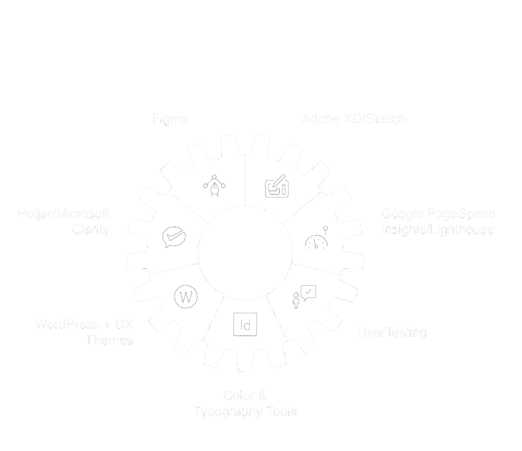
Figma (Free & Paid)
A collaborative design tool used by modern web designers to prototype, wireframe, and map user journeys.
Great for:
- Mocking up new layouts
- Sharing design drafts with clients or teams
- Creating responsive web page prototypes
Adobe XD or Sketch (Mac users)
Similar to Figma, these are pro-level design tools for building UI/UX layouts and testing interface logic.
Best for: Full-scale design teams or those creating advanced component systems.
Hotjar / Microsoft Clarity (Free)
See how real users interact with your site, where they click, how far they scroll, and where they drop off.
Great for:
- Identifying UX bottlenecks
- Testing new designs
- Watching session replays
Google PageSpeed Insights / Lighthouse
Evaluate Core Web Vitals and UX performance (especially mobile). Get actionable suggestions for speed, layout shift, and responsiveness.
Use to:
- Improve load time
- Enhance mobile usability
- Diagnose layout performance issues
WordPress + UX-Friendly Themes
Use modern, responsive WordPress themes (like Astra, Kadence, or GeneratePress) built with UX best practices baked in.
Look for:
- Mobile-first design
- Lightweight performance
- Accessibility support
Paired with builders like Elementor or Bricks, these make layout control easy — without compromising on experience.
UserTesting (Paid)
A tool to get real people to test your site and provide feedback on what works (and what doesn’t).
Great for agencies or larger businesses launching new pages or products.
Bonus: Color & Typography Tools
- Coolors.co – build professional color palettes
- Fontpair.co – test font combinations that work together
- Contrast-ratio.com – ensure ADA-compliant visual contrast
Check out our article on responsive website design on your way to building a robust online presence!
Final Word
UI/UX design isn’t just a trend, it’s a conversion tool.
The best websites aren’t just pretty. They’re useful, intuitive, and built for real people.
That’s what turns clicks into customers.
Whether you’re improving your layout, simplifying your flow, or rethinking how users interact with your site — great UI/UX design creates trust, removes friction, and drives action.
Want better results from your website?
Start by thinking like your user and designing for their journey.
FAQs
What does a UX/UI designer do?
A UI/UX designer creates websites or apps that are easy to use, visually appealing, and focused on helping users complete actions like booking, buying, or signing up.
Does a UX/UI designer need coding?
Not always. While basic HTML/CSS helps, most UI/UX designers focus on design tools and user flow — developers handle the actual coding.
What industry is UX/UI design on LinkedIn?
UI/UX design typically falls under Design, Information Technology, or Marketing & Advertising depending on the company and role.
